
My Approach
A calm and intentional experience
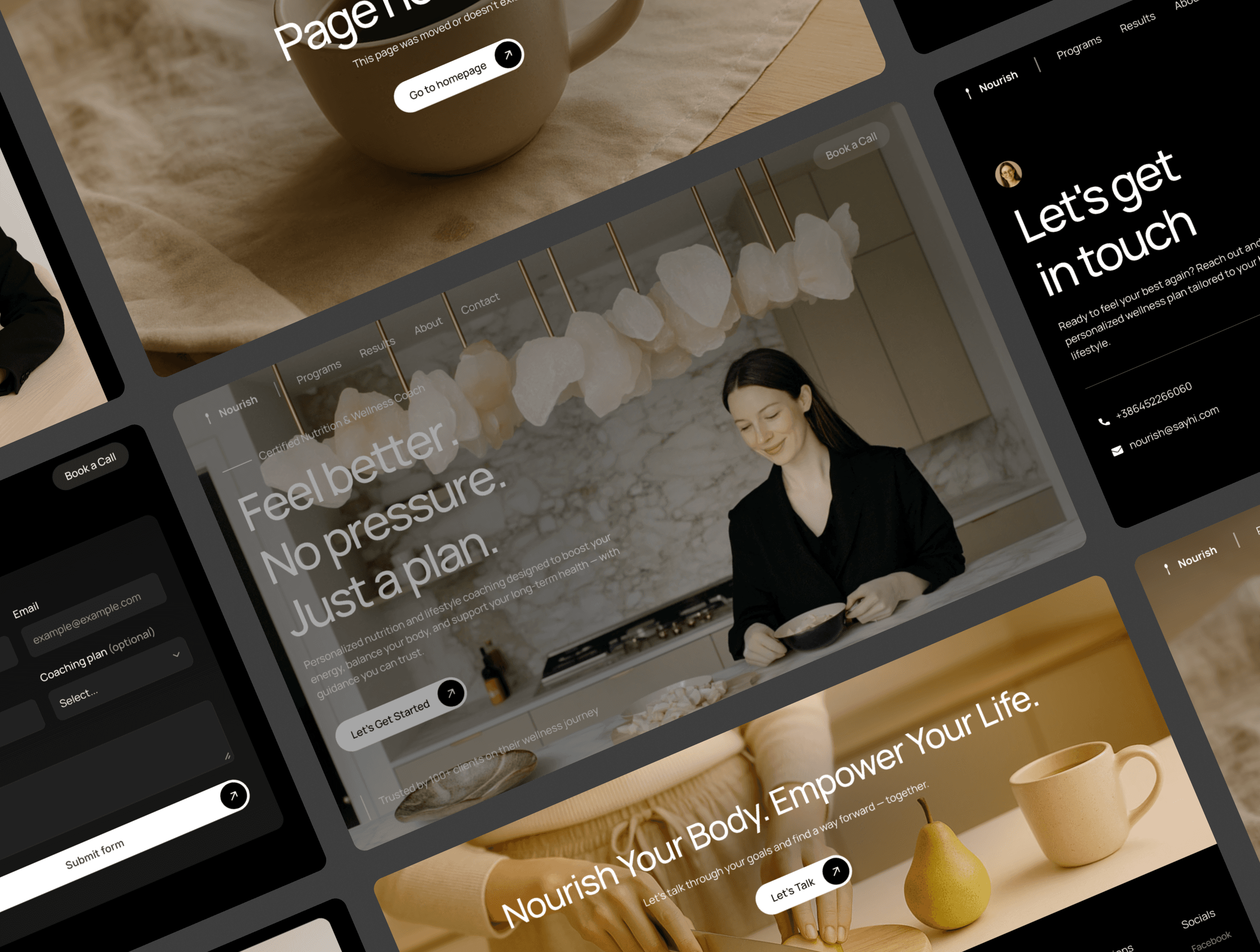
This website was created for a nutritionist whose approach is built on mindful support and sustainable change. My goal was to reflect that philosophy in every detail — through warm nude tones, minimalist structure, and a quiet, confident rhythm of navigation. From the first glance, the experience is meant to feel slow, safe, and personal.
Aesthetics that support the message
Every decision in the layout — from spacing to typography — was made to let her message breathe. There’s no clutter or distraction. Just clarity, space, and calm. It’s a design meant to echo her own values: no pressure, no templates, just thoughtful presence.
A space that builds trust
This wasn’t just about making a “beautiful” website. I wanted to help her build a space where future clients could feel seen and understood, even before reaching out. Because in wellness work, trust starts before the first message is ever sent.
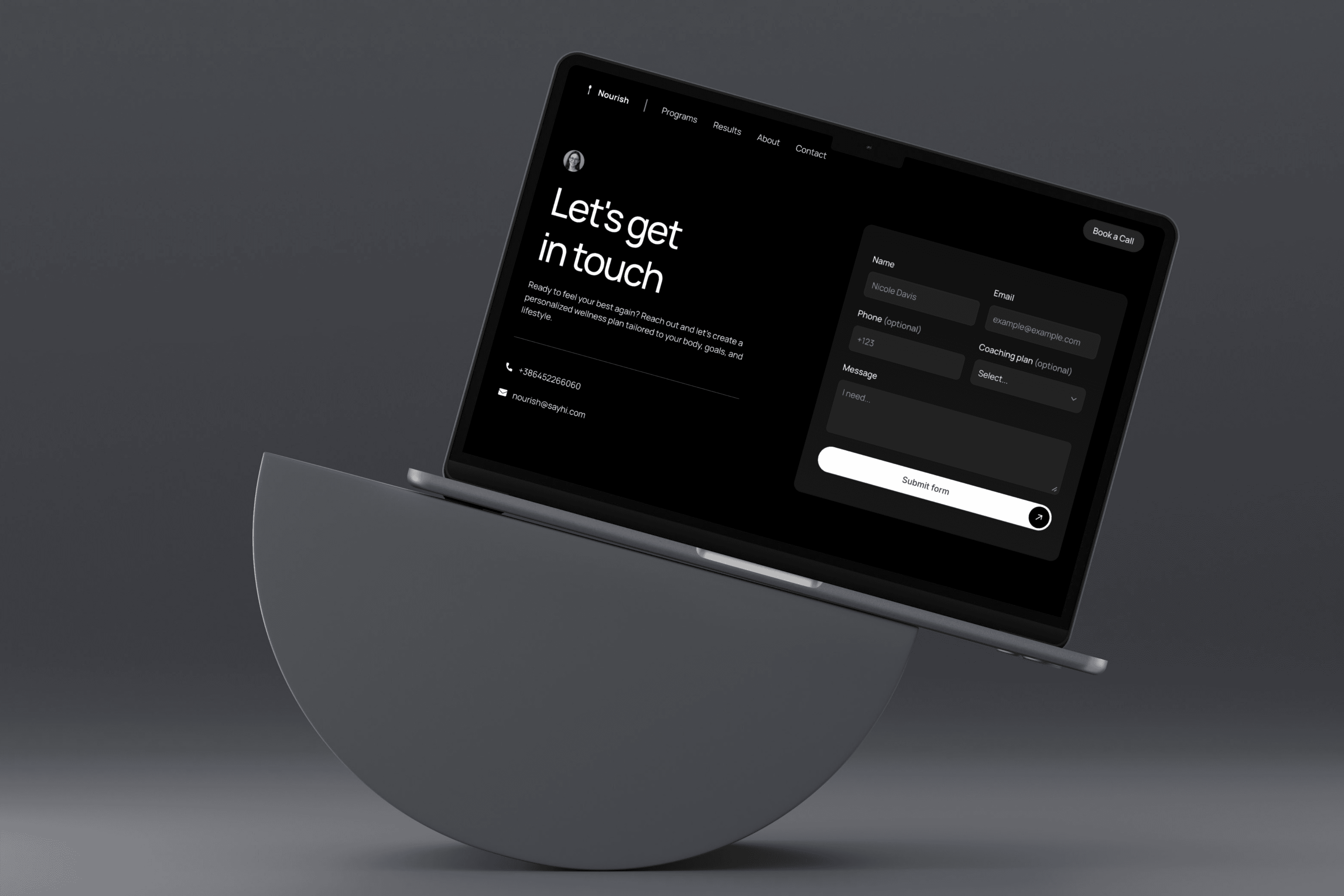
Resolving Complex Needs
Supporting someone’s wellness journey online means blending clarity, care, and structure. I designed this site to help visitors feel welcomed, guided, and gently encouraged to explore services or book a call — with no friction.
User-Centric Design
The layout is intentionally quiet and intuitive. Soft transitions, clear visual hierarchy, and warm tones let visitors move at their own pace — whether they’re browsing or ready to take the next step. From contact forms to service pages, every interaction was designed to feel natural.
Meeting Clients Where They Are
Whether someone’s just beginning their health journey or looking for long-term support, the structure is designed to meet them with calm and kindness. We included space for her story, methods, and client insights — building trust before any call is scheduled.
Thoughtfully Structured Pages
Home: A quiet welcome that invites visitors to slow down and explore.
About: A space for sharing her voice, values, and what guides her work.
Programs: Clear, approachable sections that describe the different paths she offers.
Results: A space to share reflections, client stories, or useful tips — adding warmth and depth.
Contact: Simple and friendly — reaching out should never feel intimidating.
404: Even the fine print is designed to feel consistent and respectful of the overall tone.
Designed for Accessibility and Performance
This site is built with calm accessibility in mind. It’s fast, responsive, and stripped of unnecessary friction — allowing every visitor to feel included, regardless of how or where they browse. It’s not just about looking good; it’s about feeling right.
Final Thoughts
This isn’t just a website — it’s a quiet expression of the nutritionist’s philosophy. I designed it to reflect her care, compassion, and clarity — so that the experience of the site feels like the first step in the journey she offers.


